KINGPIN
KINGPIN

The King is dead.
Long live the King.
Kingpin were looking to extend their brand beyond aesthetics - they were after an attitude. A brand platform. A swagger worthy of the ‘gram.
They got it all.
Here’s a snapshot of how everything from logo and brand design to advertising and social media rolled out.
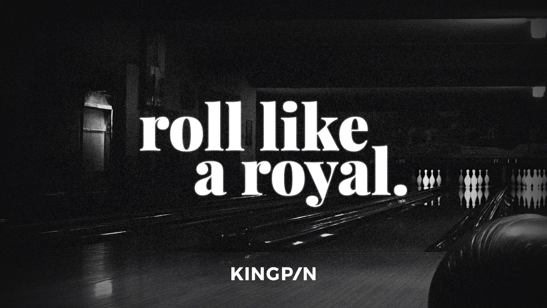
FIRST, THE CROWN.
Kingpin is anything but just another bowling alley. It was a new social hot spot with the architecture and facilities to match.
So to avoid getting in the way of that, I gave the brand a minimalist overhaul inspired by the bowling ‘spare’ symbol and a regally-reserved purple palette.


THEN, THE THRONE.
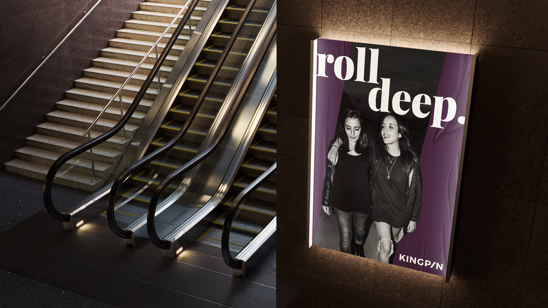
With the brand sorted brand platform, crews were invited take their place in Australia’s freshest social hotspot.


International Women’s Day brought with it a little name change.
…and the reign had begun.
It wasn’t long until crews started rolling through – sharing the moment as they took their throne.
